Projects / Pyhla Association
Pyhla Association
Brand strategy, Visual Identity & Campaign for the nonprofit organization Pyhla.
Logo Design
Symbology
The brand idea started with the shape of an earbud, which was synthesized graphically in the letter "P," the first initial of the NGO’s name as well as the word "Protect." The final monogram is the sum of the "P" and the shape of an ear. The main concept to transmit is "Protect your ears."
Branding Signboard Banner
Brand sign banner construction
The brand system utilizes Zeppelin font at the headline level, coupled with PragmataPro, which helps cultivate a contemporary aesthetic. Promotional collateral was developed to carry the message to a young audience.
Stickers design
Street Stand Banner Design
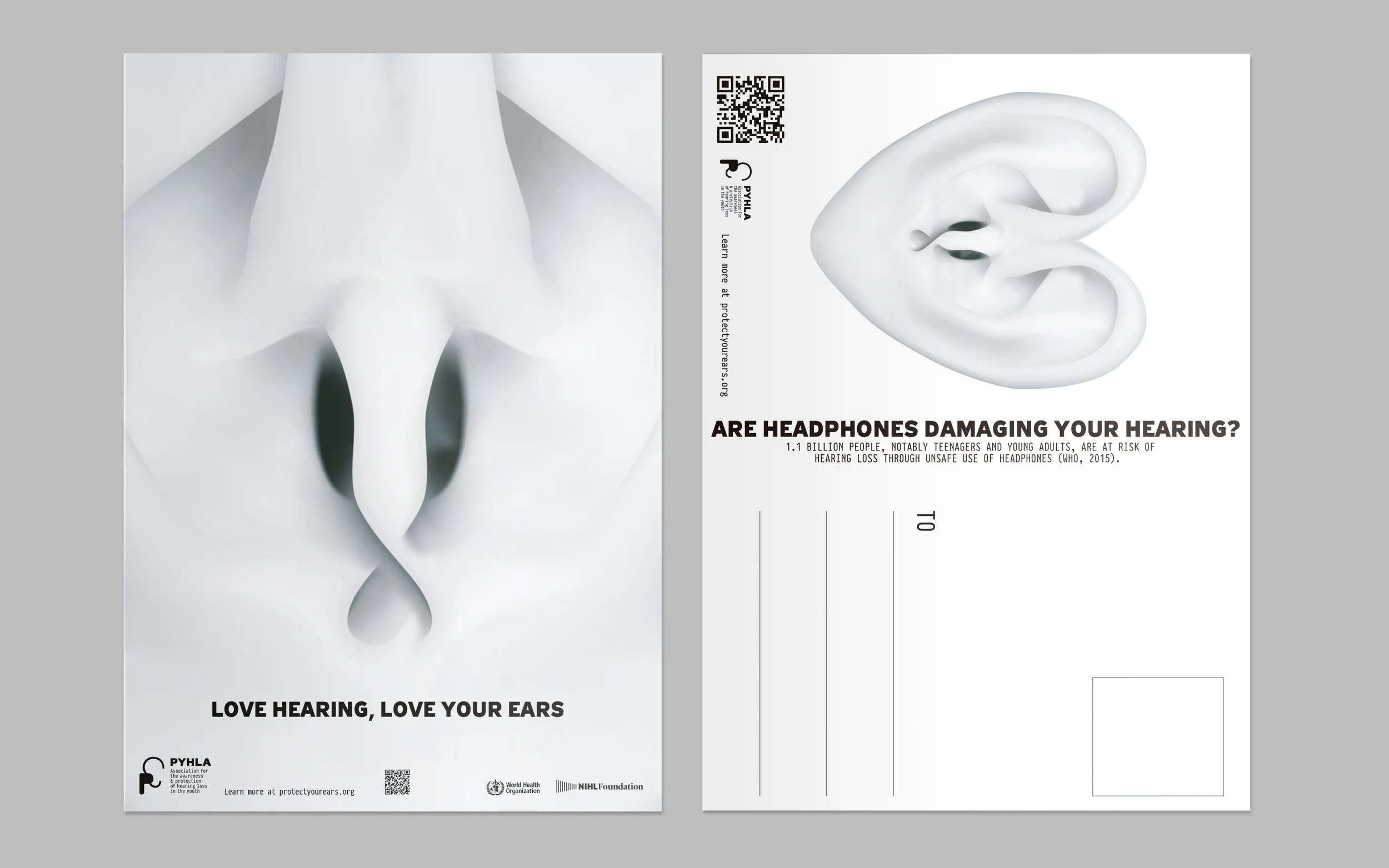
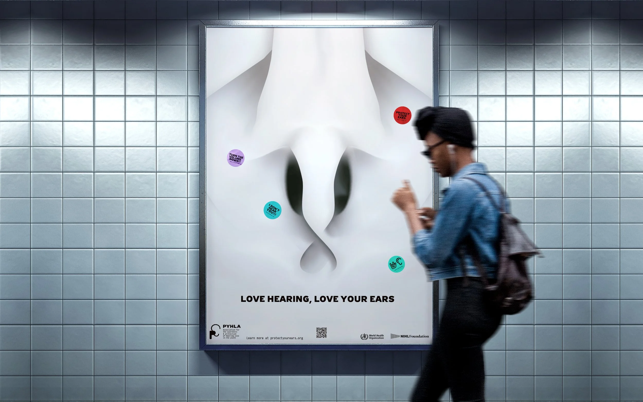
The campaign was created to disseminate information to raise awareness among current generations about the protection of their hearing health. The tone of the communication is direct and purposeful, calling young people to take action.
Street Stand Banner
Book
A deck of playing cards was created with four specific activities related to hearing health: 1. knowledge about senses; 2. knowledge of noise levels; 3. headphones or earbuds moment of use; 4. the concept of protection.
Bag
Tshirt
Postcard
Banner design in the subway
Handles design
Cards
Cards
Information Brochure


