Projects / Alddam Group
Alddam Group
Brand Identity
Corporate Video
Alddam Group is a private investment holding company and provider of transportation and logistics services whose objective is to help its clients manage their goods in the most efficient way throughout their supply chains.
Logo Design
AG asked us to generate a graphic identity that represents the union of the three partners and their four main assets through a branding system.
Corporate typeface
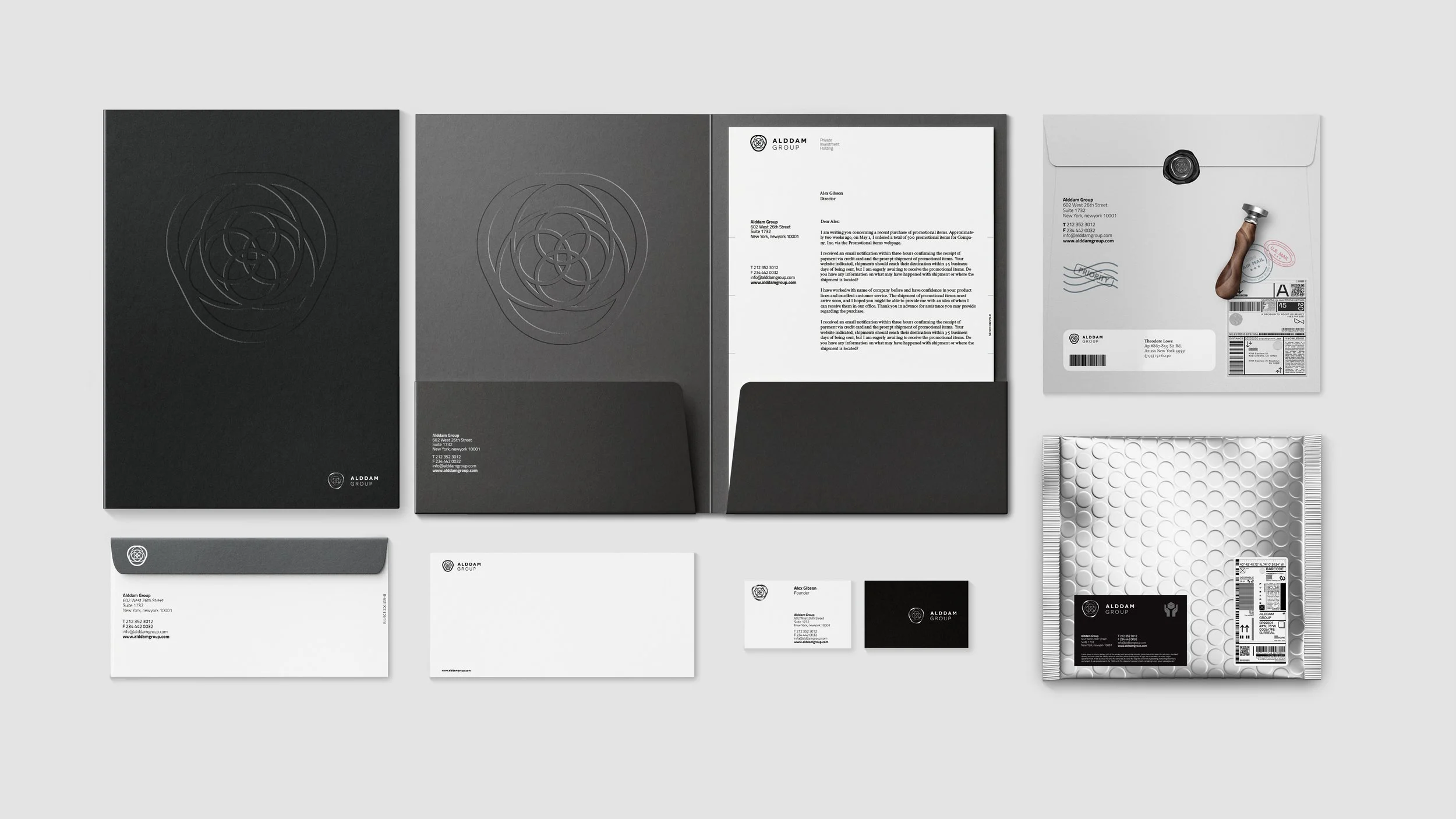
Albus Studio developed a branding system that positions AG as a reliable and sophisticated corporation in the logistics and transportation sector. The development included the Brand Identity, Annual Report, Stationary, Wayfinding directory totem, Mobile Web application, vehicles, and a mobile robot.
Mobile App
By showing the union of the four smaller circles, the symbol represents the four main assets of the group. On top of these, the joining of the three large circles symbolizes the consolidation of the three partners. As a result, the overlapping of all the circles gives a differentiated semi triangular shape. The center of the symbol, in turn, gives rise to the form of an eye, representing the constant observation of the assets for the future. At the same time, from above, the symbol shows a flower that has bloomed, symbolizing a prosperous business.

Spots

Spots

Warehouse vehicles

Corporate stationery

Annual report


